High Converting Landing Page for a Real Estate Project
Sankalp Girivaas is more than just a residential project, located in the heart of South Mumbai with a mesmerizing sea-facing skyline, this luxury real estate project needed a compelling digital presence that would reflect its architectural brilliance and aspirational value.
To design a high-conversion, visually compelling landing page that attracts potential homebuyers, builds trust, and communicates luxury without overwhelming the visitor.
➙ Establish a clean and premium brand identity
➙ Present key project information in a digestible and engaging way
➙ Guide users naturally toward submitting an enquiry (lead generation)
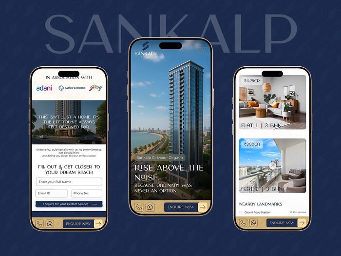
The landing page appeals to high-achieving millennials and Gen Z professionals, think founders, traders, consultants, and creatives who equate real estate with a personal milestone. It’s not just about a home; it’s about claiming a view they once dreamed of from a tiny apartment window.
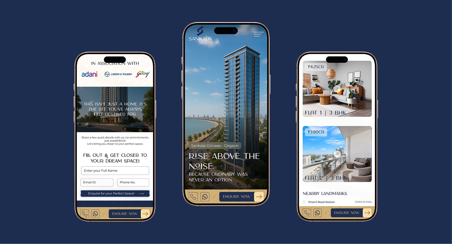
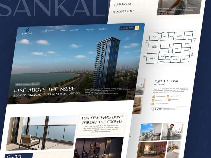
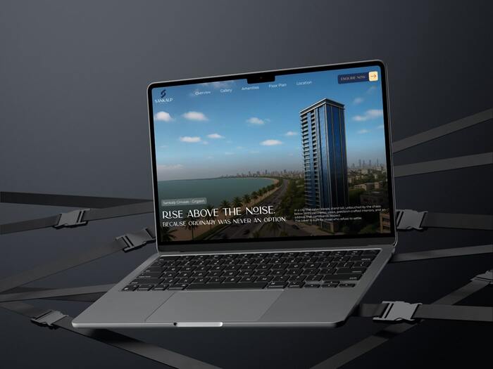
One of the key challenges while designing real estate landing pages is balancing information density with clarity. Most property websites tend to overload users with extensive details like floor plans, amenities, location maps, RERA numbers, legal disclaimers etc... which often results in a cluttered, overwhelming interface. In the process, the most critical element, the primary Call to Action (CTA) gets buried or ignored.
For this project, the main challenge was to simplify the user journey, structure content hierarchically, and design a layout where the CTA remained consistently visible and inviting without disrupting the premium feel of the page.
To appeal to young, self-made achievers with a taste for premium living, the design approach focused on clean, minimal aesthetics paired with strategic content placement. The layout was structured to guide users seamlessly through the page, highlighting key USPs, showcasing the property’s lifestyle appeal, and ensuring the primary CTA stayed prominent at every scroll depth. By stripping away non-essential clutter and leaning into bold visuals, we crafted a high-impact experience that felt both aspirational and easy to navigate.
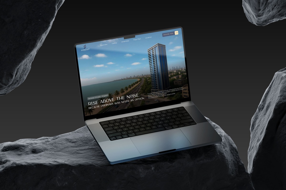
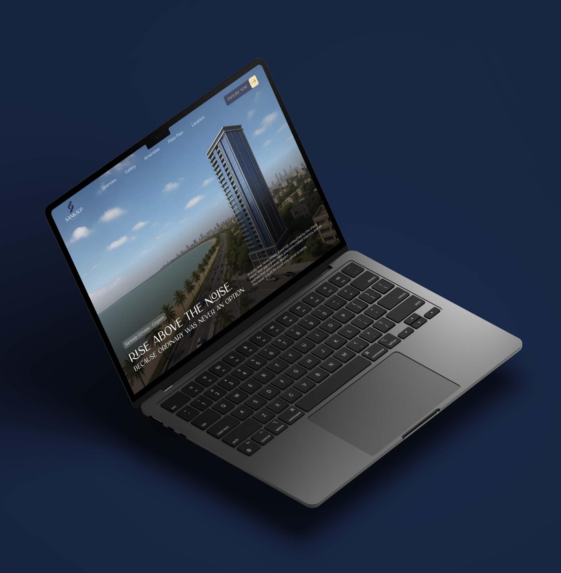
➙ Crafted a bold, aspirational headline that speaks directly to the self-made mindset.
➙ Integrated minimal yet powerful copy with a clean, high-contrast layout to reduce cognitive load.
➙ Full-screen drone view of the building with skyline, sea, and Chowpatty
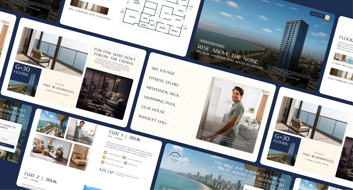
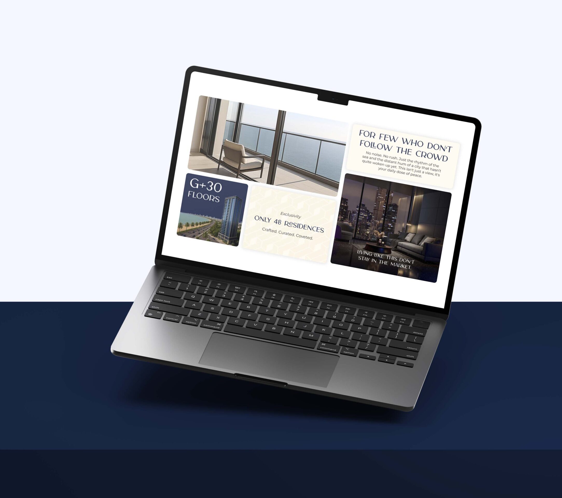
➙ Replaced dense paragraphs with scannable icon-text blocks and clean infographics.
➙ Used strong heading structure and intentional whitespace to guide users through content effortlessly.
➙ Prioritized showing over telling — aligning with our target’s preference for quick, decisive information.
➙ Optimized touch points and CTA placement for thumb-friendly navigation.
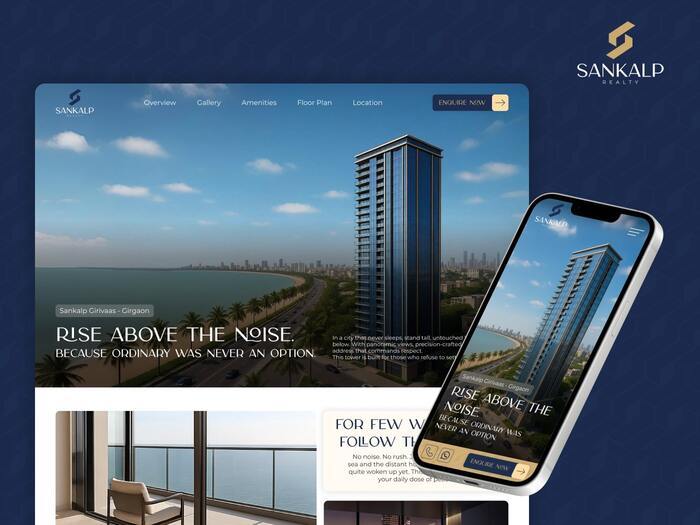
➙ Restructured content flow vertically to keep users engaged and not fatigued by long scrolling.
➙ Tested responsiveness for all breakpoints ensuring no loss of visual appeal or lead flow on mobile devices.
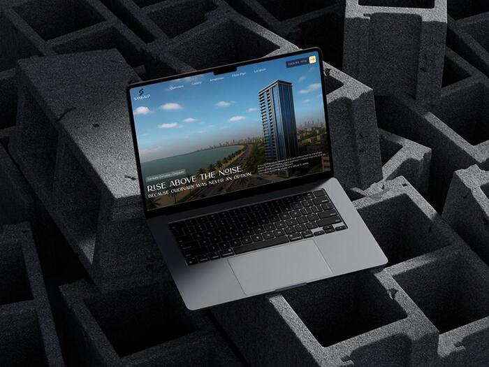
➙ Designed a sticky floating CTA button that stays visible throughout the page scroll.
➙ Ensured it's context-aware — subtly adapting its style to blend without distraction, yet staying clickable.
➙ This solves the real estate norm of scattered CTAs lost amidst overwhelming information.
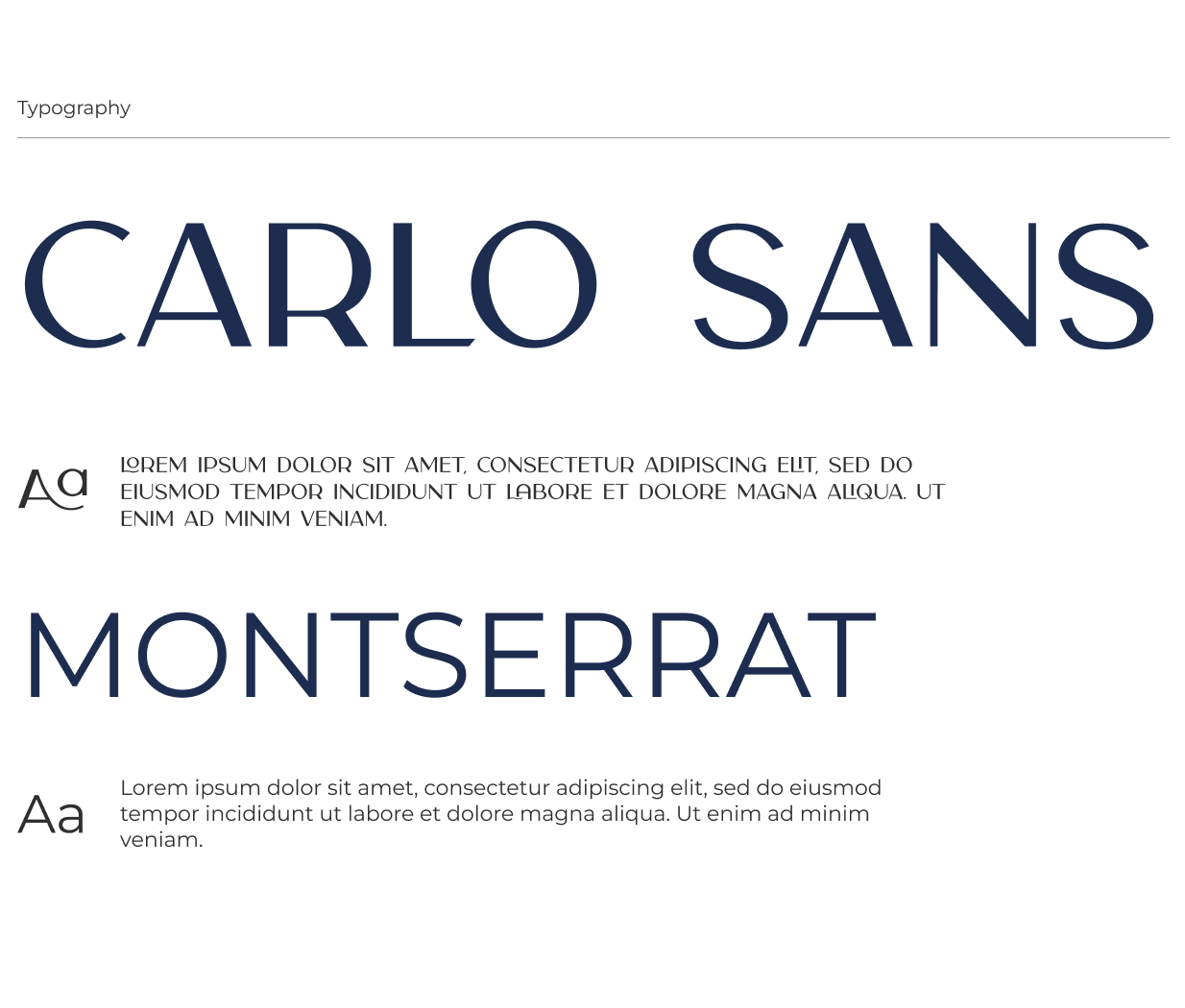
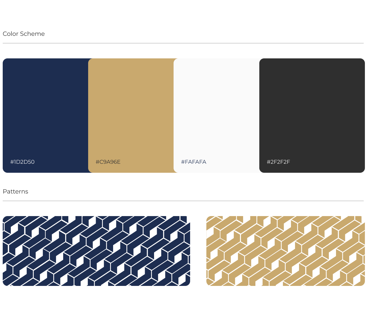
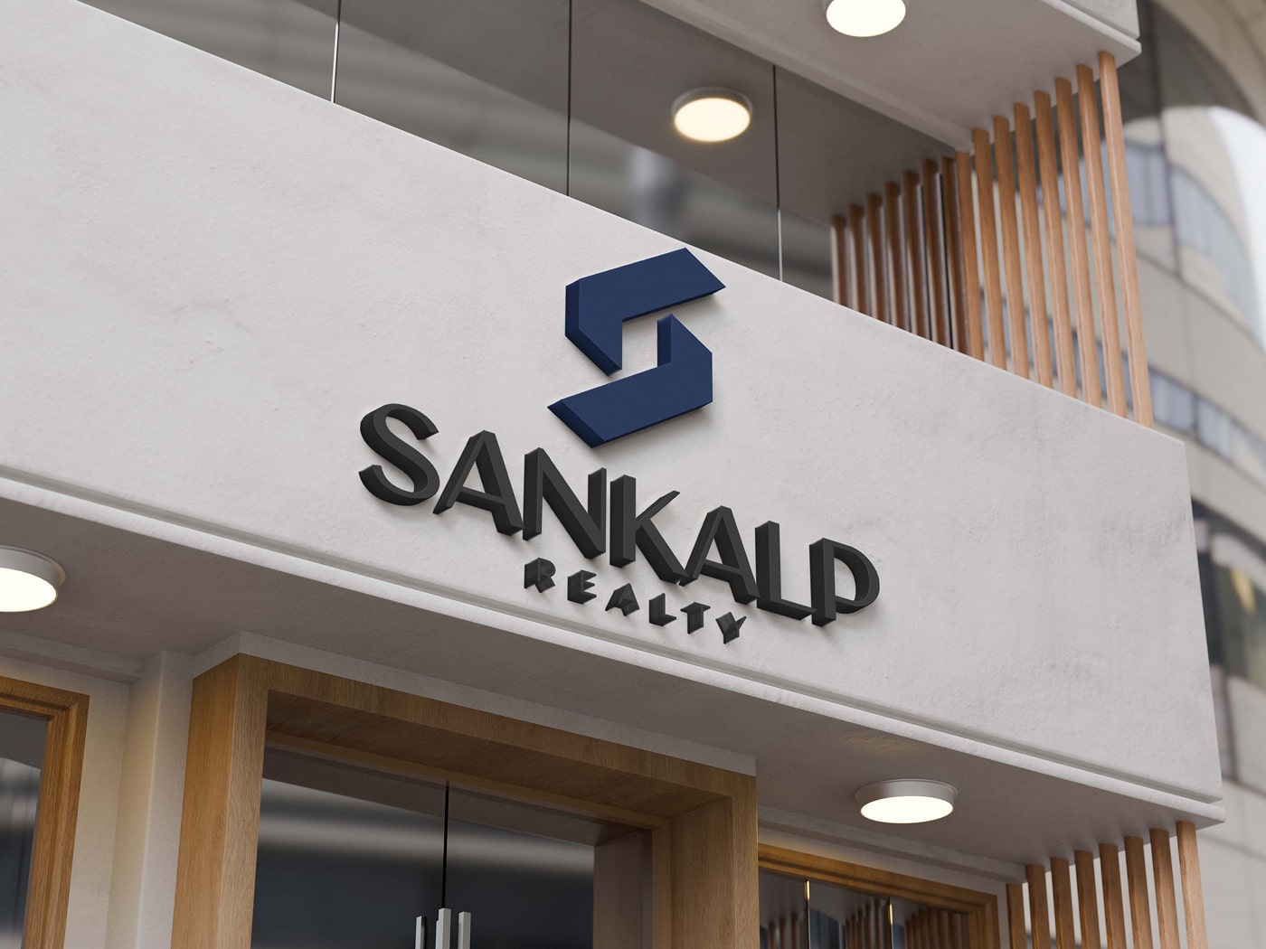
A soft, geometric pattern was used across background elements to introduce subtle sophistication. Fonts were chosen to evoke modern luxury, and color choices reflect sea, sky, and concrete — symbolic of South Mumbai’s atmosphere.