Rupeeko is a finance tracking and budgeting SaaS platform designed to simplify everyday expense management for young professionals. This is an ongoing passion project led by me and my brother, while I focus on product positioning, marketing strategy, and user experience design, he handles the technical development and implementation. The application is currently in production, and the landing page showcased here represents our first step towards marketing.
To design a high-conversion, modern landing page that builds trust, communicates the app’s value, and drives downloads of the Rupeeko web app.
➙ Craft a minimal, trustworthy brand identity that feels approachable yet reliable
➙ Address real user problems around expense tracking in a relatable and solution-first way
➙ Encourage visitors to download and try the app with clear CTAs and strong social proof
Rupeeko is designed for everyday individuals who want to build better financial habits without complex tools. Our audience includes students, young professionals, gig workers, and anyone who wants a simple, intuitive way to track spending and save smarter, no spreadsheets or jargon, just clarity and control.
The personal finance app space is saturated with overly technical interfaces and complex onboarding flows. The biggest challenge was to present Rupeeko’s utility in a way that felt simple, relatable, and trustworthy — all while ensuring that users quickly understand the app’s value and are nudged toward downloading it.
We had to strike the right balance between minimalism and information, keeping it clean yet convincing, and ensuring the download CTA remained visible without feeling pushy.
To connect with users who aren’t “finance experts,” we leaned into a friendly, clutter-free aesthetic and emotionally resonant messaging. The layout flows naturally, starting with a crisp intro, then walking users through relatable money pain-points, feature highlights, and finally, strong social proof to drive trust.
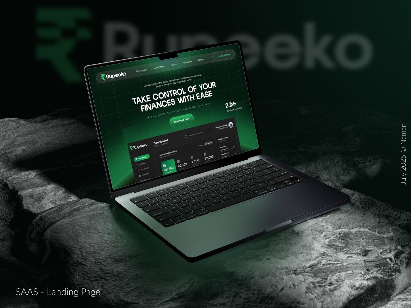
A soft visual rhythm and gentle microinteractions guide users toward the goal: downloading the Rupeeko web app. The end result? A high-conversion landing page that’s as effortless to use as the app itself.
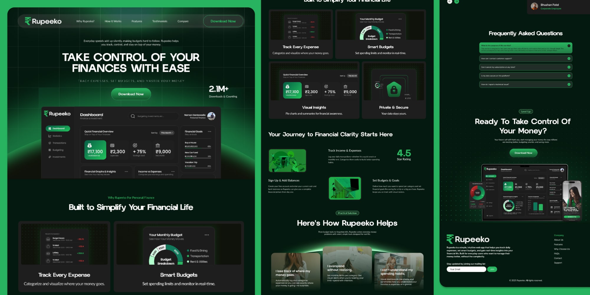
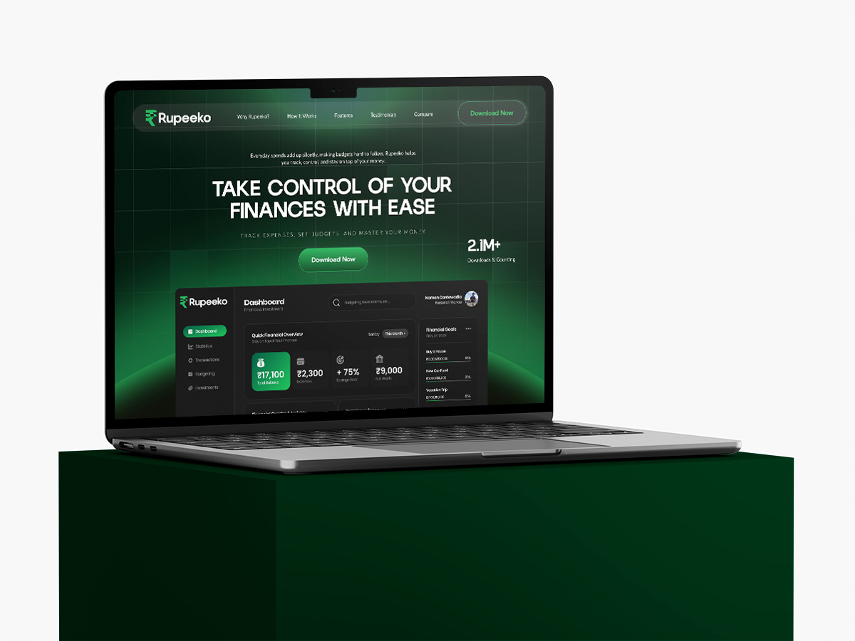
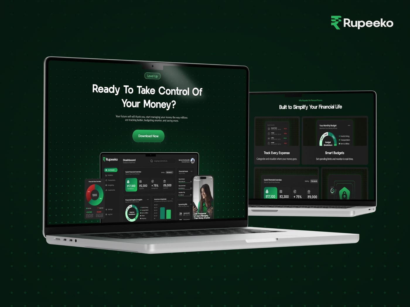
➙ Instantly communicates the app’s purpose: “Take Control of Your Finances With Ease.”
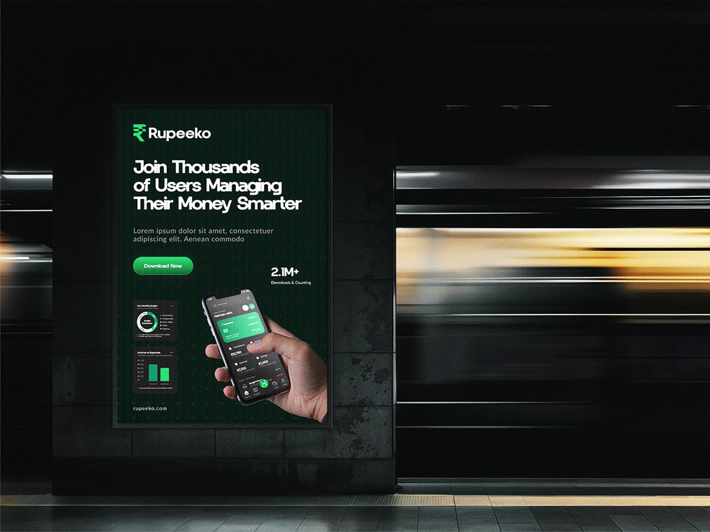
➙ Shows social proof with “2.1M+ Downloads & Counting” to build credibility.
➙ Prominent ‘Download Now’ button ensures users know what action to take next.
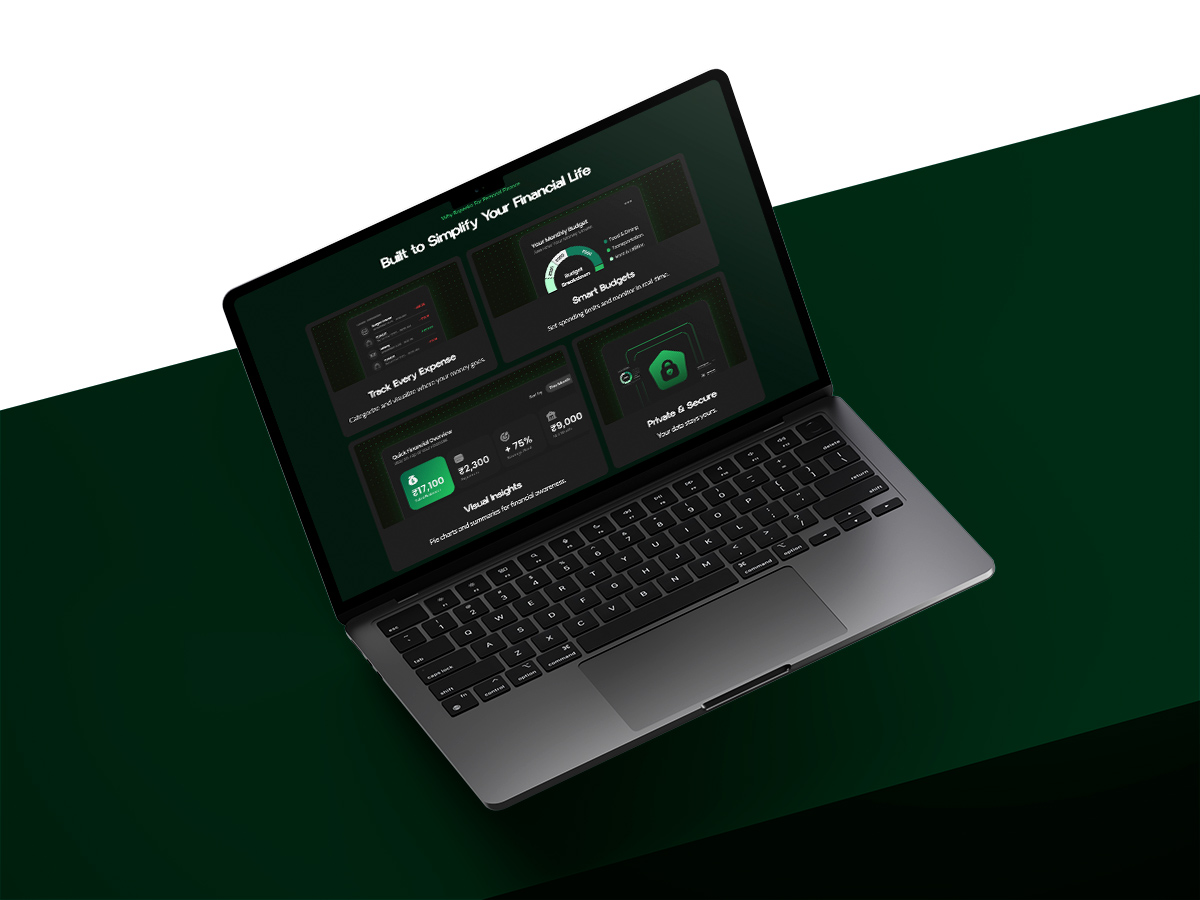
➙ Offers quick scannability of app benefits — helps in user decision-making.
➙ Uses consistent icons and compact UI previews to showcase functionality.
➙ Reinforces trust with “Private & Secure” messaging right in the features section.
➙ Connects emotionally by highlighting common user pain points.
➙ Uses short, personal statements like “I overspend without realizing” to build empathy.
➙ Transitions smoothly into the value the app provides — making the benefit personal.
➙ Addressed common doubts using relatable user statements for a conversational tone.
➙ Personal anecdotes add authenticity (“I had no idea how much I spent on chai until Rupeeko showed me!”).
➙ Visually distinct layout: clean spacing, subtle dividers, and emphasis on human elements like name and photo.
➙ Builds trust and handles objections simultaneously, supporting app downloads by resolving both questions and hesitations in one go.
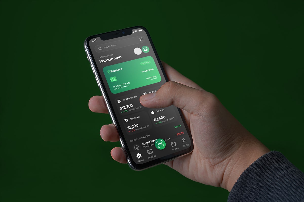
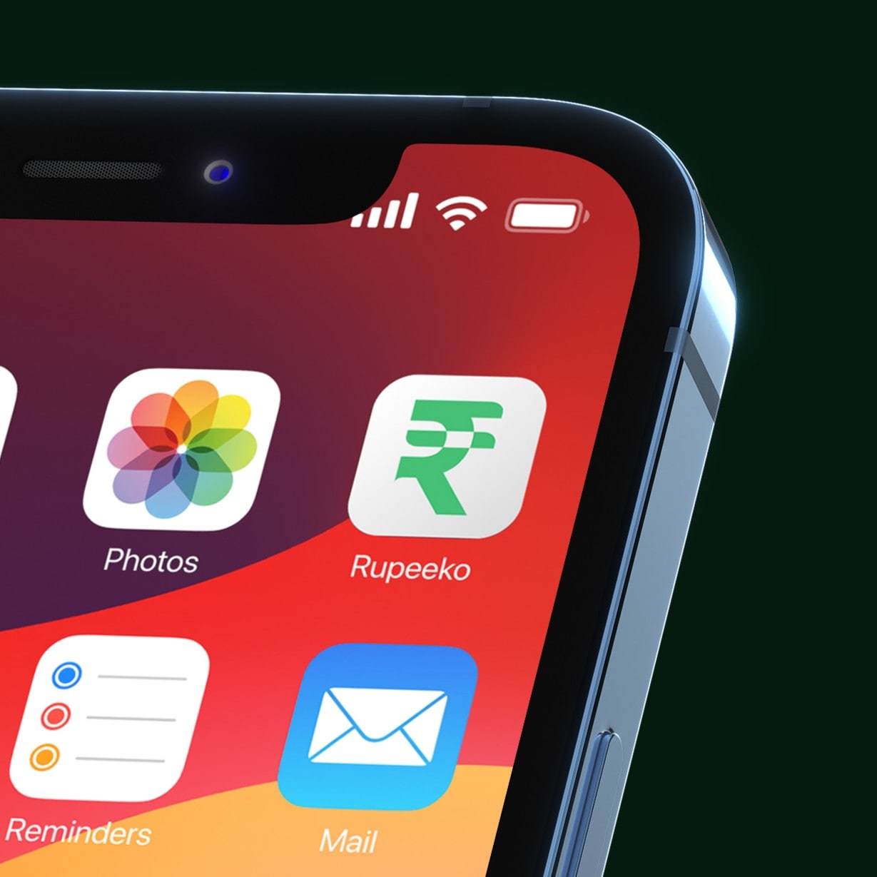
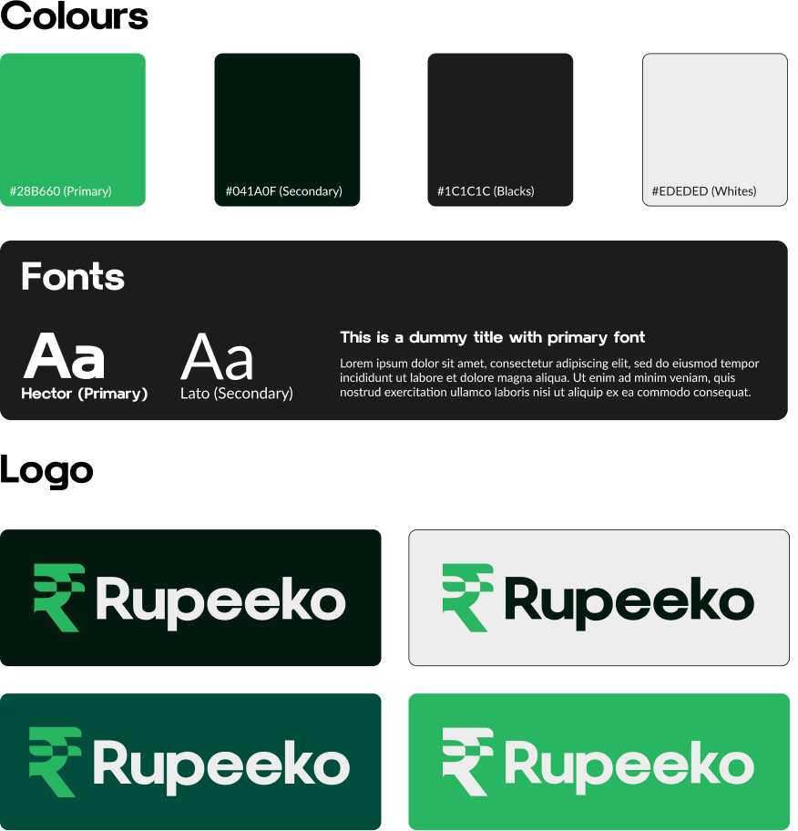
Rupeeko’s visual language reflects simplicity, trust, and modernity. A dark theme enhances readability and creates a premium feel, while the signature green color subtly evokes growth and financial wellbeing. Rounded, approachable typography and soft visual cues add warmth, striking a balance between tech-forward design and human connection.